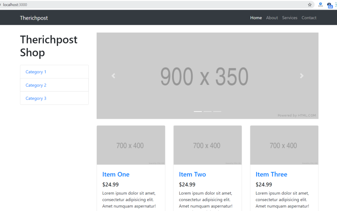
Hello friends, welcome back to my blog. Today in this blog post, I am going to show you, Reactjs Shopping Template Free.
For reactjs new comers, please check the below link:
Reactjs Basic Tutorials
Friends now I proceed onwards and here is the working code snippet for Reactjs Responsive Sidebar Template Free and please use this carefully to avoid the mistakes:
1. Firstly, we need fresh reactjs setup and for that, we need to run below commands into out terminal and also we should have latest node version installed on our system:
npx create-react-app reacttepmate

cd reacttepmate

npm start
2. Now we need to run below commands into our project terminal to get bootstrap and related modules into our reactjs application:
npm install bootstrap --save

npm install jquery --save

npm install popper.js --save

npm start //For start project again
3. Finally for the main output, we need to add below code into our projectname/src/App.json file or if you have fresh setup then you can replace projectname/src/App.js file code with below code:
import React from 'react';
import './App.css';
//Bootstrap4.5
import 'bootstrap/dist/css/bootstrap.min.css';
import 'bootstrap/dist/js/bootstrap.min.js';
class App extends React.Component {
render() {
return (
<div className="MainDiv">
<nav class="navbar navbar-expand-lg navbar-dark bg-dark fixed-top">
<div class="container">
<a class="navbar-brand" href="#">Therichpost</a>
<button class="navbar-toggler" type="button" data-toggle="collapse" data-target="#navbarResponsive" aria-controls="navbarResponsive" aria-expanded="false" aria-label="Toggle navigation">
<span class="navbar-toggler-icon"></span>
</button>
<div class="collapse navbar-collapse" id="navbarResponsive">
<ul class="navbar-nav ml-auto">
<li class="nav-item active">
<a class="nav-link" href="#">Home
<span class="sr-only">(current)</span>
</a>
</li>
<li class="nav-item">
<a class="nav-link" href="#">About</a>
</li>
<li class="nav-item">
<a class="nav-link" href="#">Services</a>
</li>
<li class="nav-item">
<a class="nav-link" href="#">Contact</a>
</li>
</ul>
</div>
</div>
</nav>
<div class="container">
<div class="row">
<div class="col-lg-3">
<h1 class="my-4">Therichpost Shop</h1>
<div class="list-group">
<a href="#" class="list-group-item">Category 1</a>
<a href="#" class="list-group-item">Category 2</a>
<a href="#" class="list-group-item">Category 3</a>
</div>
</div>
<div class="col-lg-9">
<div id="carouselExampleIndicators" class="carousel slide my-4" data-ride="carousel">
<ol class="carousel-indicators">
<li data-target="#carouselExampleIndicators" data-slide-to="0" class="active"></li>
<li data-target="#carouselExampleIndicators" data-slide-to="1"></li>
<li data-target="#carouselExampleIndicators" data-slide-to="2"></li>
</ol>
<div class="carousel-inner" role="listbox">
<div class="carousel-item active">
<img class="d-block img-fluid" src="http://placehold.it/900x350" alt="First slide" />
</div>
<div class="carousel-item">
<img class="d-block img-fluid" src="http://placehold.it/900x350" alt="Second slide" />
</div>
<div class="carousel-item">
<img class="d-block img-fluid" src="http://placehold.it/900x350" alt="Third slide" />
</div>
</div>
<a class="carousel-control-prev" href="#carouselExampleIndicators" role="button" data-slide="prev">
<span class="carousel-control-prev-icon" aria-hidden="true"></span>
<span class="sr-only">Previous</span>
</a>
<a class="carousel-control-next" href="#carouselExampleIndicators" role="button" data-slide="next">
<span class="carousel-control-next-icon" aria-hidden="true"></span>
<span class="sr-only">Next</span>
</a>
</div>
<div class="row">
<div class="col-lg-4 col-md-6 mb-4">
<div class="card h-100">
<a href="#"><img class="card-img-top" src="http://placehold.it/700x400" alt="" /></a>
<div class="card-body">
<h4 class="card-title">
<a href="#">Item One</a>
</h4>
<h5>$24.99</h5>
<p class="card-text">Lorem ipsum dolor sit amet, consectetur adipisicing elit. Amet numquam aspernatur!</p>
</div>
<div class="card-footer">
<small class="text-muted">★ ★ ★ ★ ☆</small>
</div>
</div>
</div>
<div class="col-lg-4 col-md-6 mb-4">
<div class="card h-100">
<a href="#"><img class="card-img-top" src="http://placehold.it/700x400" alt="" /></a>
<div class="card-body">
<h4 class="card-title">
<a href="#">Item Two</a>
</h4>
<h5>$24.99</h5>
<p class="card-text">Lorem ipsum dolor sit amet, consectetur adipisicing elit. Amet numquam aspernatur! Lorem ipsum dolor sit amet.</p>
</div>
<div class="card-footer">
<small class="text-muted">★ ★ ★ ★ ☆</small>
</div>
</div>
</div>
<div class="col-lg-4 col-md-6 mb-4">
<div class="card h-100">
<a href="#"><img class="card-img-top" src="http://placehold.it/700x400" alt="" /></a>
<div class="card-body">
<h4 class="card-title">
<a href="#">Item Three</a>
</h4>
<h5>$24.99</h5>
<p class="card-text">Lorem ipsum dolor sit amet, consectetur adipisicing elit. Amet numquam aspernatur!</p>
</div>
<div class="card-footer">
<small class="text-muted">★ ★ ★ ★ ☆</small>
</div>
</div>
</div>
<div class="col-lg-4 col-md-6 mb-4">
<div class="card h-100">
<a href="#"><img class="card-img-top" src="http://placehold.it/700x400" alt="" /></a>
<div class="card-body">
<h4 class="card-title">
<a href="#">Item Four</a>
</h4>
<h5>$24.99</h5>
<p class="card-text">Lorem ipsum dolor sit amet, consectetur adipisicing elit. Amet numquam aspernatur!</p>
</div>
<div class="card-footer">
<small class="text-muted">★ ★ ★ ★ ☆</small>
</div>
</div>
</div>
<div class="col-lg-4 col-md-6 mb-4">
<div class="card h-100">
<a href="#"><img class="card-img-top" src="http://placehold.it/700x400" alt="" /></a>
<div class="card-body">
<h4 class="card-title">
<a href="#">Item Five</a>
</h4>
<h5>$24.99</h5>
<p class="card-text">Lorem ipsum dolor sit amet, consectetur adipisicing elit. Amet numquam aspernatur! Lorem ipsum dolor sit amet.</p>
</div>
<div class="card-footer">
<small class="text-muted">★ ★ ★ ★ ☆</small>
</div>
</div>
</div>
<div class="col-lg-4 col-md-6 mb-4">
<div class="card h-100">
<a href="#"><img class="card-img-top" src="http://placehold.it/700x400" alt="" /></a>
<div class="card-body">
<h4 class="card-title">
<a href="#">Item Six</a>
</h4>
<h5>$24.99</h5>
<p class="card-text">Lorem ipsum dolor sit amet, consectetur adipisicing elit. Amet numquam aspernatur!</p>
</div>
<div class="card-footer">
<small class="text-muted">★ ★ ★ ★ ☆</small>
</div>
</div>
</div>
</div>
</div>
</div>
</div>
<footer class="py-5 bg-dark">
<div class="container">
<p class="m-0 text-center text-white">Copyright © Your Website 2020</p>
</div>
</footer>
</div>
);
}
}
export default App;
4. Now friends, we need to below code into our projectname/src/App.css file for some custom styling:
body{padding-top: 60px;}
Now we are done friends. If you have any kind of query or suggestion or any requirement then feel free to comment below.
Note: Friends, I just tell the basic setup and things, you can change the code according to your requirements. For better understanding must watch video above.
I will appreciate that if you will tell your views for this post. Nothing matters if your views will be good or bad.
Jassa
Thanks
The post Reactjs Shopping Template Free appeared first on Therichpost.
This content was originally published here.