Building A Google Password Manager Clone With React JS and Fauna
Authored in connection with the Write with Fauna program.
This article will walk you through how I built a password manager with React JS and Fauna. Password managers are essential. When we have multiple accounts and multiple passwords, we need to keep track of them. Tracking passwords is difficult without having a password manager to help you.
Prerequisites
Getting Started With Fauna
First, create an account with Fauna.
Creating A Fauna Database
To create a fauna database, head to the fauna dashboard.
Next, click on the New Database button, enter the database name, and click enter.
Creating Fauna Collections
A collection is a grouping of documents(rows) with the same or a similar purpose. A collection acts similar to a table in a traditional SQL database.
In the app we’re creating, we’ll have two collections, users and passwords. The user collection is where we’ll be storing our user data, while the passwords collection is where we’ll be keeping all the password data.
To create these collections, click on the database you created, click New Collection. Enter only the collection name (users), then click save and do the same for the second collection (passwords).
Creating Fauna Indexes
Use indexes to quickly find data without searching every document in a database collection every time a database collection is accessed. Indexes can be created using one or more fields of a database collection. To create a Fauna index, click on the indexes section on the left of your dashboard.
In this application, we will be creating the following indexes:
Setting Up The Application
Moving forward, we will be using the below starter project. Begin with cloning the project on Github
git clone <https://github.com/Babatunde13/password-manager-started-code.git>
cd password-manager-starter-code
npm install
After cloning the repo, the following files/folders will be downloaded:
src/screens: This folder is where all the pages(screens) we have in the app are defined. The following screens are defined in the screen folder:
Home.js: This is the home page.
Signin.js: This is the Sign-in page.
Signup.js: This is the signup page.
App.js: This is the dashboard page.
src/components: This is the folder where we create all the components in the app. The following components are created in the components folder:
Flash: This folder contains a flash.js and a flash.css file. The component exported in the flash.js file is used for flashing messages across the app.
createPassword.modal.js: This is a modal that is shown when trying to create a new password.
editPassword.modal.js: This modal is shown when a user tries to update a password.
Navbar.js: This is the navbar component.
Passwords.js: This component renders the passwords and is imported into the app dashboard.
previewPassword.modal.js: This modal is shown when a user previews a password.
Environment Variables
Our app has two environment variables, as we can see in the sample env file, REACT_APP_FAUNA_KEY, and REACT_APP_SECRET_KEY. When creating environment variables with React and create_react_app, we need to prefix the environment variables with REACT_APP_.
Generating Your Fauna Secret Key
The Fauna secret key connects an application or script to the database, and it is unique per database. To generate your key, go to your dashboard’s security section and click on New Key. Enter your key name, and a new key will be generated for you. Paste the key in your .env file in this format REACT_APP_FAUNA_KEY={{ API key}}
Application Secret Key
Your application secret key has to be private, and no one should have access to it. We will use the application secret key to encrypt passwords before storing them in our database. Add your secret key in your .env file in this format: REACT_APP_SECRET_KEY={{ secret key}}
Running Our Boilerplate Application
So far, we’ve looked at our app structure, now is a great time to run our boilerplate app. To run the app, we type npm start in the root directory. We should see the following after the server starts:
You can test other endpoints by manually editing the endpoints with what we’ve currently defined in our src/App.js file. The image below shows the /login endpoint:
Let’s discuss what is going on in this component. First, a couple of files in our screens folder are imported, alongside a couple of libraries.
Home Page
Let’s build the home page of our app. Change the content of src/screens/Home.js to the following:
import NavbarComponent from "../components/Navbar";
import Container from 'react-bootstrap/Container';
import { Link } from 'react-router-dom'
import { FontAwesomeIcon } from '@fortawesome/react-fontawesome';
import { faHeart } from '@fortawesome/free-solid-svg-icons'
import {Flash} from '../components/Flash/flash'
import hero1 from '../assets/illus8.jpg';
import hero from '../assets/illus4.png';

const Home = () => {
  return (
    <div>
      <NavbarComponent />
      <Flash />
      <Container style={{height : "70vh", display : "flex", alignItems : "center", justifyContent : "center", overflow : "hidden"}}>
        <img src={hero1} alt="" className="h-25 shadow-lg mx-2" style={{border : "none", borderRadius : "15px"}} />
        <img src={hero} alt="" className="shadow-lg" style={{border : "none", borderRadius : "15px", maxWidth : "90%", maxHeight : "75%"}} />
        <img src={hero1} alt="" className="h-25 shadow-lg mx-2" style={{border : "none", borderRadius : "15px"}} />
      </Container>
      <p className="navbar fixed-bottom d-block w-100 m-0 text-center" style={{backgroundColor : "#d1e1f0e7"}} >Built with <FontAwesomeIcon icon={faHeart} className="text-danger" /> by <Link target="_blank" to={{ pathname: "https://twitter.com/bkoiki950"}}>Babatunde Koiki</Link> and <Link target="_blank" to={{ pathname: "https://twitter.com/AdewolzJ"}}>wolz-CODElife</Link></p>
    </div>
  )
}

export default Home
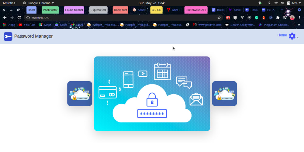
There isn’t much happening here, just JSX. Go back to the browser to view the content of the application; you should see the following:
Navbar Component
Change the content of your src/components/Navbar.js to the following:
import {useState} from 'react'
import Navbar from 'react-bootstrap/Navbar'
import Nav from 'react-bootstrap/Nav'
import NavDropdown from 'react-bootstrap/NavDropdown'
import { Link } from 'react-router-dom'
import CreatePasswordModal from '../components/createPassword.modal'
import favicon from '../assets/favicon.png'
import { FontAwesomeIcon } from '@fortawesome/react-fontawesome';
import { faUserCircle, faCog } from '@fortawesome/free-solid-svg-icons'

const NavbarComponent = (props) => {
  const [createModalShow, setCreateModalShow] = useState(false);
  const handleHide = (url, password, email, name) => {
    let n = true
    if (url || password || email || name) {n = window.confirm("Your changes won't be saved...")}
    if (n) setCreateModalShow(false)
  }

  const handleCreate = payload => {
    props.handleCreate(payload)
    setCreateModalShow(false)
  }

 return (
  <Navbar expand="lg" className="navbar-fixed-top"
  style={{position : "sticky", top : "0", zIndex: "10000", backgroundColor : "#d1e1f0e7"}}>
    <Navbar.Brand as={Link} to="/" style={{cursor : 'pointer'}}>
    <img src={favicon} alt="" style={{width : '40px', height : '40px'}} className="mr-2" />
    Password Manager
    </Navbar.Brand>

    <Navbar.Toggle aria-controls="basic-navbar-nav" />

    <Navbar.Collapse id="basic-navbar-nav">
      <Nav className="ml-auto">
        <Link to="/" className="mt-2" style={{textDecoration : "none"}}>Home</Link>

        {!localStorage.getItem('userId') ?
          <>
            <NavDropdown title={<FontAwesomeIcon icon={faUserCircle} size="2x" className="text-primary" />} alignRight id="basic-nav-dropdown">
              <NavDropdown.Item as={Link} to="/login" className="text-primary">Sign in</NavDropdown.Item>
              <NavDropdown.Item as={Link} to="/register" className="text-primary">Register</NavDropdown.Item>
            </NavDropdown>
          </>:
          <>
            <NavDropdown title={<FontAwesomeIcon icon={faCog} size="2x" className="text-primary" />} alignRight id="basic-nav-dropdown">
              <NavDropdown.Item as={Link} to="/dashboard" className="text-primary" >Dashboard</NavDropdown.Item>
              <CreatePasswordModal show={createModalShow} onHide={handleHide} handleCreate={ handleCreate } />
              <NavDropdown.Item to="#" onClick={() => setCreateModalShow(true)} className="text-primary" >Create New Password</NavDropdown.Item>
              <NavDropdown.Divider />
              <NavDropdown.Item as={Link} to="/logout" className="text-primary" >Logout</NavDropdown.Item>
            </NavDropdown>
          </>
        }
      </Nav>
      </Navbar.Collapse>
    </Navbar>
  )
}

export default NavbarComponent
The application home page should now look like this:
This Navbar is a dynamic component. What is displayed in the dropdown depends on if the user is authenticated or not. If the user is not logged in, a sign-in and signup button is shown; if the user is logged in, a create password button, dashboard button, and logout button are displayed. This component has a local state called createModal, which is set to false by default and is used to determine if the create password button is clicked. If this button is clicked, the create password modal is displayed. The handleCreate function is passed as a prop to the CreatePasswordModal component to create a new password. The handleHide function is used to hide the modal when the user clicks somewhere outside the modal or the cancel button. We also check if there is no data passed, and we need to be sure that the user wants to close the modal. Check if the user object exists in the localStorage, which we’ll set whenever a user signs in. If you notice, the Flash component is displayed in the app as raw text. We need to update the component.
Flash Component
Replace the content of your src/components/Flash/flash.js with the following:
import React, { useEffect, useState } from 'react';
import {event} from '../../App';
import './flash.css';
import { FontAwesomeIcon } from "@fortawesome/react-fontawesome";
import { faTimesCircle } from '@fortawesome/free-solid-svg-icons'

export const Flash = () => {
 let [visibility, setVisibility] = useState(false);
 let [message, setMessage] = useState('');
 let [type, setType] = useState('');

 useEffect(() => {
 event.addListener('flash', ({message, type}) => {
 setVisibility(true);
 setMessage(message);
 setType(type);
 });
 }, []);

 useEffect(() => {
 setTimeout(() => {
 setVisibility(false);
 }, 10000)
 })

 return (
    visibility &&
      <div className={`alert alert-${type}`}>
        <br />
        <p>{message}</p>
        <span className="close">
          <FontAwesomeIcon icon={faTimesCircle} onClick={() => setVisibility(false)} />
        </span>
        <br />
    </div>
  )
}
This component is rendered when we emit an event in any part of our app. We need the event class exported from our root App.js component. This event object is what we’ll be emitting. We listen for an event that will give us the message and type emitted (Recall that: that’s what we wanted to listen for as defined in the App.js file). We created three states, message, type, and visibility. On listening for the event, we update the message and type states to what is returned, and we set the visibility to true. The flash component should only be visible only for a short time(10 seconds) if the user doesn’t remove it manually. We also created another useEffect which we use to turn the visibility to false back after 10 seconds. We returned some content if visibility was true. If you check the app now, you shouldn’t see anything for flash as the visibility is false. The type state is used for dynamic styling the way we have warning, success, and error alerts in bootstrap. We’ll create our Signin and Signup components next, but before that, we need to create two functions in our models.js, which we’d be using to create a user and sign a user in.
User Models
At the end of the src/models.js file, type the following:
export const createUser = async (firstName, lastName, email, password) => {
  password = await bcrypt.hash(password, bcrypt.genSaltSync(10))
  try {
    let newUser = await client.query(
    q.Create(
      q.Collection('users'),
        {
          data: {
            firstName,
            email,
            lastName,
            password
          }
        }
      )
    )
    if (newUser.name === 'BadRequest') return
    newUser.data.id = newUser.ref.value.id
    return newUser.data
  } catch (error) {
    return
  }
}

export const getUser = async (userId) => {
  const userData = await client.query(
    q.Get(
      q.Ref(q.Collection('users'), userId)
    )
  )
  if (userData.name === "NotFound") return
  if (userData.name === "BadRequest") return "Something went wrong"
  userData.data.id = userData.ref.value.id
  return userData.data
}

export const loginUser = async (email, password) => {
  let userData = await client.query(
    q.Get(
      q.Match(q.Index('user_by_email'), email)
    )
  )
  if (userData.name === "NotFound") return
  if (userData.name === "BadRequest") return "Something went wrong"
  userData.data.id = userData.ref.value.id
  if (bcrypt.compareSync(password, userData.data.password)) return userData.data
  else return
}
Signup Page
Change your src/screens/Signup.js file to the following:
import { useState } from 'react'
import { createUser } from '../models';
import {useHistory} from 'react-router-dom'
import Form from "react-bootstrap/Form";
import { Link } from 'react-router-dom'
import Col from "react-bootstrap/Col";
import Button from "react-bootstrap/Button";
import Container from "react-bootstrap/Container";
import NavbarComponent from '../components/Navbar';
import { FontAwesomeIcon } from '@fortawesome/react-fontawesome';
import { faUserCircle } from '@fortawesome/free-solid-svg-icons'
import { Flash } from '../components/Flash/flash';

export default function SignIn() {

  const history = useHistory()
    if (localStorage.getItem('userId')) {
      setTimeout(() => {
      window.flash('You are logged in', 'warning')
      }, 100)
    history.push('/')
  }

  const [validated, setValidated] = useState(false);

  const handleSubmit = async (e) => {
    e.preventDefault()
    const body = {
      firstName: e.target.firstName.value,
      lastName: e.target.lastName.value,
      email: e.target.email.value,
      password: e.target.password.value
    }

    try {
      if (body.firstName && body.lastName && body.password && body.email && body.password === e.target.confirm_password.value) {
        const user = await createUser(body.firstName, body.lastName, body.email, body.password)
        if (!user) {
          window.flash('Email has been chosen', 'error')
        } else {
          localStorage.setItem('userId', user.id)
          localStorage.setItem('email', user.email)
          history.push('/')
          window.flash('Account created successfully, signed in', 'success')
        }
      } else if (!body.firstName || !body.email || !body.lastName || !e.target.confirm_password.value) {
        setValidated(true)
      } else {
        setValidated(true)
      }
    } catch (error) {
      console.log(error)
      window.flash('Something went wrong', 'error')
    }
  }

 return (
    <>
      <NavbarComponent />
      <Flash /> <br/><br/>
      <Container className='d-flex flex-column align-items-center justify-content-center pt-5' style={{height : '80vh'}}>
        <p className="h3 display-4 mt-5"><FontAwesomeIcon icon={faUserCircle} size="1x" /></p>
        <p className="h2 display-5">Register</p>
        <Form noValidate validated={validated} onSubmit={handleSubmit} style={{minWidth : '300px' }}>
          <Form.Row>
            <Form.Group as={Col} md="6" controlId="validationCustom01">
              <Form.Label>First name</Form.Label>
              <Form.Control required name='firstName' type="text" placeholder="First name" />
              <Form.Control.Feedback type="invalid">Please provide your first name.</Form.Control.Feedback>
              <Form.Control.Feedback>Great name!</Form.Control.Feedback>
            </Form.Group>
            <Form.Group as={Col} md="6" controlId="validationCustom02">
              <Form.Label>Last Name</Form.Label>
              <Form.Control required name='lastName' type="text" placeholder="Last name" />
              <Form.Control.Feedback type="invalid">Please provide your last name.</Form.Control.Feedback>
              <Form.Control.Feedback>Looks good!</Form.Control.Feedback>
            </Form.Group>
            <Form.Group as={Col} md="12" controlId="validationCustomUsername">
              <Form.Label>Email</Form.Label>
              <Form.Control type="email" placeholder="Email" aria-describedby="inputGroupPrepend" required name='email' />
              <Form.Control.Feedback type="invalid">Please choose a valid and unique email.</Form.Control.Feedback>
              <Form.Control.Feedback>Looks good!</Form.Control.Feedback>
            </Form.Group>
          </Form.Row>
          <Form.Row>
            <Form.Group as={Col} md="6" controlId="validationCustom04">
              <Form.Label>Password</Form.Label>
              <Form.Control type="password" placeholder="Password" required name='password' />
              <Form.Control.Feedback type="invalid">Please provide a password between 8 and 20.</Form.Control.Feedback>
              <Form.Control.Feedback>Looks good!</Form.Control.Feedback>
            </Form.Group>
            <Form.Group as={Col} md="6" controlId="validationCustom04">
              <Form.Label>Confirm Password</Form.Label>
              <Form.Control type="password" placeholder="Confirm Password" required name='confirm_password' />
              <Form.Control.Feedback type="invalid">Fields do not match.</Form.Control.Feedback>
              <Form.Control.Feedback>Looks good!</Form.Control.Feedback>
            </Form.Group>
          </Form.Row>
          <Button type="submit">Register</Button>
          <p className="text-center"><Link to="/login">Sign in</Link> if already registered!</p>
        </Form>
      </Container>
    </>
  )
}
The validated data is sent to the createUser function, and if it returns a user object, then the user is created; else, the user exists.
Go to the sign-up page now and create an account.
Sign in Page
Change your src/screens/Signin.js file to the following:
import { useState} from 'react'
import { useHistory } from 'react-router-dom';
import {loginUser} from '../models'
import Form from "react-bootstrap/Form";
import Col from "react-bootstrap/Col";
import Button from "react-bootstrap/Button";
import { Link } from 'react-router-dom'
import Container from "react-bootstrap/Container";
import NavbarComponent from '../components/Navbar';
import { FontAwesomeIcon } from '@fortawesome/react-fontawesome';
import { faUserCircle } from '@fortawesome/free-solid-svg-icons'
import { Flash } from '../components/Flash/flash';

export default function SignIn() {

  const history = useHistory()
  if (localStorage.getItem('userId')) {
    setTimeout(() => {
      window.flash('You are logged in', 'warning')
    }, 100)
    history.push('/')
  }

  const [validated, setValidated] = useState(false)

  const handleSubmit = async (event) => {
    event.preventDefault();
    const body = {
      email: event.target.email.value,
      password: event.target.password.value
    }

    // Handle login logic

    if (!body.email || !body.password) {
      setValidated(true)
    } else {
      const user = await loginUser(body.email, body.password)
      if (user) {
        localStorage.setItem('userId', user.id)
        localStorage.setItem('email', user.email)
        history.push('/')
        window.flash('Logged in successfully!', 'success')
      } else {
        window.flash('Invalid email or password', 'error')
      }
    }
  }

 return (
    <>
      <NavbarComponent />
      <Flash />
      <Container className='d-flex flex-column align-items-center justify-content-center' style={{height : '80vh'}}>
        <p className="h3 display-4"><FontAwesomeIcon icon={faUserCircle} size="1x" /></p>
        <p className="h2 display-5">Sign in</p>
        <Form noValidate validated={validated} onSubmit={handleSubmit} style={{minWidth : '300px' }}>
          <Form.Row>
            <Form.Group as={Col} md="12" controlId="validationCustom01">
              <Form.Label>Email</Form.Label>
              <Form.Control required name='email' type="email" placeholder="Email" />
              <Form.Control.Feedback type="invalid">Please provide a valid email.</Form.Control.Feedback>
              <Form.Control.Feedback>Looks Good!</Form.Control.Feedback>
            </Form.Group>
          </Form.Row>
          <Form.Row>
            <Form.Group as={Col} md="12" controlId="validationCustom02">
              <Form.Label>Password</Form.Label>
              <Form.Control required name='password' type="password" placeholder="Password" />
              <Form.Control.Feedback type="invalid">Please provide a password.</Form.Control.Feedback>
              <Form.Control.Feedback>Looks good!</Form.Control.Feedback>
            </Form.Group>
          </Form.Row>
          <Button type="submit">Sign in</Button>
          <p className="text-center"><Link to="/register">Register</Link> to create account!</p>
        </Form>
      </Container>
      </>
    )
  }
This component is similar to the Signup component.
Password Model
Update the models.js file by adding functions that will help create, edit, delete, and get passwords in our application. Add the following to the end of the src/models.js file:
export const createPassword = async (accountName, accountUrl, email, encryptedPassword, userId) => {

  let user = await getUser(userId)
  const date = new Date()
  const months = [
    "January", "February", "March", "April", "May", "June",
    "July", "August", "September", "October", "November", "December"
  ]
  let newPassword = await client.query(
    q.Create(
      q.Collection('passwords'),
      {
        data: {
          accountName,
          accountUrl,
          email,
          encryptedPassword,
          created__at: `${months[date.getMonth()]} ${date.getDate()}, ${date.getFullYear()}`,
          user: {
            email: user.email,
            id: user.id
          }
        }
      }
    )
  )
  if (newPassword.name === 'BadRequest') return
  newPassword.data.id = newPassword.ref.value.id
  return newPassword.data
}


export const getPasswordsByUserID = async id => {
  let passwords = []
  try {
    let userPasswords = await client.query(
      q.Paginate(
        q.Match(q.Index('user_passwords'), id)
      )
    )
    if (userPasswords.name === "NotFound") return
    if (userPasswords.name === "BadRequest") return "Something went wrong"
    for (let passwordId of userPasswords.data) {
      let password = await getPassword(passwordId.value.id)
      passwords.push(password)
    }
    return passwords
  } catch (error) {
    return
  }
}

export const getPassword = async id => {
  let password = await client.query(
    q.Get(q.Ref(q.Collection('passwords'), id))
  )
  if (password.name === "NotFound") return
  if (password.name === "BadRequest") return "Something went wrong"
  password.data.id = password.ref.value.id
  return password.data
}

export const updatePassword = async (payload, id) => {
  let password = await client.query(
    q.Update(
      q.Ref(q.Collection('passwords'), id),
      {data: payload}
    )
  )
  if (password.name === "NotFound") return
  if (password.name === "BadRequest") return "Something went wrong"
  password.data.id = password.ref.value.id
  return password.data
}

export const deletePassword = async id => {
  let password = await client.query(
    q.Delete(
      q.Ref(q.Collection('passwords'), id)
    )
  )
  if (password.name === "NotFound") return
  if (password.name === "BadRequest") return "Something went wrong"
  password.data.id = password.ref.value.id
return password.data
}
The getPasswordsByUserID function uses the user_passwords index we created earlier to filter the collection and return the result. It searches through the collection and returns an array of all passwords whose data.user.id is the same as the given id.
Dashboard Page
Update your src/screens/App.js with the following:
import { useState, useEffect } from 'react'
import {
  getPasswordsByUserID,
  createPassword,
  deletePassword,
  updatePassword
} from "../models";
import 'bootstrap/dist/css/bootstrap.min.css';
import Passwords from '../components/Passwords';
import NavbarComponent from '../components/Navbar';
import { useHistory } from 'react-router';
import { Flash } from '../components/Flash/flash';

const AppDashboard = () => {
  const history = useHistory()
  if (!localStorage.getItem('userId')) {
    setTimeout(() => {
      window.flash('You need to be logged in', 'warning')
    }, 100)
    history.push('/login')
  }

  const [passwords, setPasswords] = useState([])
  const [isPending, setIsPending] = useState(false)

  const handleCreate = async password => {
  // save to dB
    password.userId = localStorage.getItem('userId')
    const newPassword = await createPassword(
      password.accountName,
      password.accountUrl,
      password.email,
      password.encryptedPassword,
      password.userId
    )
    setPasswords([newPassword, ...passwords])
    window.flash('New contact created successfully', 'success')
  }

  useEffect(() => {
    setIsPending(true)
    const getContacts = async () => {
      let passwordData = await getPasswordsByUserID(localStorage.getItem('userId'))
      setPasswords(passwordData)
    }
    getContacts()
    setIsPending(false)
  }, [])

 return (
 <>
  <NavbarComponent passwords={ passwords} handleCreate={ handleCreate }/>
  <Flash />
  <Passwords isPending={isPending} passwords={passwords}
      handleEdit={async payload => {
        await updatePassword({
          accountName: payload.accountName,
          accountUrl: payload.accountUrl,
          email: payload.email,
          encryptedPassword: payload.password
        }, payload.id)
        setPasswords(passwords.map( password => password.id === payload.id? payload : password))
      }}
      handleDelete={async id => {
        await deletePassword(id)
        setPasswords(passwords.filter( ele => ele.id !== id))
      }}
  />
 </>
 );
}

export default AppDashboard;
As you might have known, this page is protected from unauthenticated users. So we check if the user object is present in the localStorage first, and if the user is not logged in, we redirect back to the sign-in page.
The dashboard renders the passwords component, which displays passwords to the DOM. This component has two states: passwords and isPending. While fetching the data from the database the isPending component is set to true. When the password data is successfully fetched from the database the isPending state is set back to false and the passwords state is set to the retrieved data. While fetching the passwords data from the database, a spinner is displayed on the DOM. We achieve this by checking if the isPending state is set to true and if it is true a spinner is displayed in the dashboard.
The passwords component takes the following props:
Passwords Component
Replace the content of the src/components/Passwords.js file with the following:
import Button from 'react-bootstrap/Button'
import Container from 'react-bootstrap/Container'
import Form from "react-bootstrap/Form";
import Row from "react-bootstrap/Row";
import CryptoJS from "crypto-js";
import dotenv from 'dotenv'
import { useState } from 'react'
import PreviewPasswordModal from './previewPassword.modal'
import web from '../assets/web.png';
import { Col } from 'react-bootstrap';
import { FontAwesomeIcon } from '@fortawesome/react-fontawesome';
import { faSpinner } from '@fortawesome/free-solid-svg-icons'

dotenv.config()

const Password = ({
 id,
 accountName,
 accountUrl,
 email,
 password,
 handleDelete,
 handleEdit
}) => {
 const [editModal, setEditModal] = useState(false)
 const [previewModal, setpreviewModal] = useState(false)
 const title_ = accountName || accountUrl

 const previewPassword = () => {
 setpreviewModal(true)
 }

 const editPassword = (payload) => {
 handleEdit(payload)
 setEditModal(false)
 window.flash('Password edited successfully', 'success')
 }

 const deletePassword = () => {
 handleDelete(id)
 window.flash('Password deleted successfully', 'success')
 }

 return (
    <Col sm="12">
      <Button style={{backgroundColor: "white", color: 'black', margin: '5px 0px', width: "100%"}} onClick={previewPassword}>
        <Row>
          <Col sm={1}><img src={web} alt="" /></Col>
          <Col className="text-left mt-1">{accountName}</Col>
        </Row>
      </Button>
      <PreviewPasswordModal
        id={id}
        show={previewModal}
        edit={editModal}
        onHideEdit={()=>{setEditModal(false)}}
        onEdit={()=>{setEditModal(true)}}
        onDelete={() => {deletePassword(); setpreviewModal(false)}}
        accountName={accountName}
        accountUrl={accountUrl}
        email={email}
        password={password}
        editPassword={editPassword}
        title={"Preview Password for "+title_}
        onHide={() => {setpreviewModal(false)}}
      />
    </Col>
  )
}

const Passwords = ({passwords, handleEdit, handleDelete, isPending}) => {
  return (
    <Container className="p-3 my-5 bordered">
      {isPending ?
        <p className="my-5 py-5 h2 display-4 w-100" style={{textAlign : "center"}}>
          <FontAwesomeIcon icon={faSpinner} spin />
        </p>
      :
      <>
        <Row className="p-2 text-white" style={{backgroundColor : "dodgerblue"}}>
          <Col xs={12} sm={6} className="pt-2">{passwords ? passwords.length: 0} Sites and Apps</Col>
          <Col xs={12} sm={6}>
          <Form inline onSubmit={(e) => {e.preventDefault()}}>
            <input type="text" placeholder="Search Passwords" className="form-control ml-md-auto" onChange={(e)=> {e.preventDefault()}} />
          </Form>
          </Col>
        </Row>
        <br/><br/>
        <Row>
            {passwords.length > 0?
              passwords.map(ele => {
                const bytes = CryptoJS.AES.decrypt(ele.encryptedPassword, process.env.REACT_APP_SECRET_KEY);
                const password = bytes.toString(CryptoJS.enc.Utf8)
                const passwordData = {...ele, password}
                return <Password {...passwordData} key={ele.id} handleEdit={handleEdit} handleDelete={handleDelete} />
              }) :
              <p className="my-5 py-5 h2 display-5 w-100" style={{textAlign : "center"}}>You have not created any passwords</p>
            }
        </Row>
      </>
      }
    </Container>
  )
}

export default Passwords
This file contains two components: Password and Passwords components. Our dashboard will display a list of passwords in the same style, so it is important to have a component that displays a single password that we can use in the Passwords components. Let’s look at the Password component first.
The following is going on in the Password component:
The component takes in these props:
id: The id of the password generated from the database (Fauna)
accountName: Name of the application that we’re saving the password to
accountUrl: URL of the application that we’re saving the password to
email: Can either be the email or username, depending on what you’re using to log in to
password: Password used to login into the application.
handleDelete: Function that is called when we click on the delete button
handleEdit: Functions that is called when we edit a password
This component has two states:
editModal: Sate used in the editPassword component. It is used to set the show property of the modal
previewModal: State used in the PreviewPassword component to set the show property of the modal
Three functions are created in this component:
previewPassword: Used to set the state of PreviewModal state to true
This function is called when we click on a password in our dashboard
editPassword: This function calls then handleEdit props which comes from src/screens/App.js. The handleEdit props communicate with the editPassword function in our models.js file. This editPassword function calls this handleEdit function, then sets the value of the setEditModal state back to false, and finally flashes a success message.
deletePassword: Calls the handleDelete props and flashes a success message
The return statement of this component is a Col from react-bootstrap; this Col contains a button with an onClick of previewPassword, which makes the preview password modal show. The second content returned from this component is the PreviewPasswordModal modal itself. You can check out how to use modals with react-bootstrap using this link. This component also has some extra props like accountName, accountUrl, which I displayed in the modal.
Let’s now look at what is going on in the Passwords component: This component is stateless; it takes in the following props:
Encryption is the act of turning a text into a code so that unauthorized users won’t have access to it. The science of encrypting and decrypting information is called cryptography. You can check out this article to get a better understanding of encryption. There are two types of encryption: symmetric and asymmetric encryption.
You can check this article for a better understanding of these types of encryption.
Why Do We Need To Encrypt?
If we store raw passwords in our database and an authorized user gains access to the database, all our user data will be compromised, so we need a way to securely store their data so the admin can not get the raw text. You may be thinking, why not? Because even though we want to store encrypted data, we still want to view the raw password in the application, the need to encrypt and decrypt these passwords arises. If we hash the passwords, we can not decrypt them as it is one-way encryption, unlike encryption which is two-way encryption.
In this application, for simplicity, we’ll be using symmetric encryption. There are many encryption algorithms, but I used Advances Encryption Standard(AES). We will be using the crypto-js package. As you’ve noticed in the Passwords component, we will decrypt the passwords since we have encrypted passwords in the database.
This is a sample data in our database.
If you go the dashboard route, you should see the following:
Create Password Component
The createPasswordModal only returns the text create password, which is seen in the dropdown in the navbar. Let’s work on that component. In your src/components/createPassword.modal.js file, type the following:
import Modal from 'react-bootstrap/Modal'
import Container from "react-bootstrap/Container";
import Button from "react-bootstrap/Button";
import Form from "react-bootstrap/Form";
import Row from "react-bootstrap/Row";
import Col from "react-bootstrap/Col";
import CryptoJS from "crypto-js";
import { FontAwesomeIcon } from '@fortawesome/react-fontawesome';
import { faPlus } from '@fortawesome/free-solid-svg-icons'
import { useState } from 'react'
import dotenv from 'dotenv'

dotenv.config()

const CreatePasswordModal = props => {
 const [accountName, setAccountName] = useState('')
 const [accountUrl, setAccountUrl] = useState('')
 const [email, setEmail] = useState('')
 const [password, setPassword] = useState('')

 const handleCreate = async () => {
  const encryptedPassword = CryptoJS.AES.encrypt(password, process.env.REACT_APP_SECRET_KEY).toString()
  const payload = {
    accountName,
    accountUrl,
    email,
    encryptedPassword
  }
  props.handleCreate(payload)
  setAccountName('')
  setAccountUrl('')
  setEmail('')
  setPassword('')
  window.flash('Password created successfully', 'success')
 }

  const onHide = () => {
    props.onHide(accountUrl, password, email, accountName)
  }

 return (
  <Modal
    {...props} size="xlg"  aria-labelledby="contained-modal-title-vcenter" centered onHide={onHide}
  >
    <Modal.Header style={{backgroundColor : "#d1e1f0"}} closeButton>
      <Modal.Title id="contained-modal-title-vcenter">Create New Password</Modal.Title>
    </Modal.Header>
    <Modal.Body className="show-grid">
      <Container>
        <Form>
          <Row>
            <Form.Group as={Col}>
              <Form.Control placeholder="Account Name" value={accountName} onChange={(e) => setAccountName(e.target.value)}/>
            </Form.Group>
            <Form.Group as={Col}>
              <Form.Control placeholder="Account URL" defaultValue={`https://${accountUrl}`} onChange={(e) => setAccountUrl(e.target.value)}/>
            </Form.Group>
          </Row>
          <Row>
            <Form.Group as={Col}>
              <Form.Control type="email" value={email} placeholder="Email" onChange={(e) => setEmail(e.target.value)}/>
            </Form.Group>
          </Row>
          <Row>
            <Form.Group as={Col}>
              <Form.Control type="password" value={password} placeholder="Password" onChange={(e) => setPassword(e.target.value)}/>
            </Form.Group>
          </Row>
        </Form>
      </Container>
    </Modal.Body>
    <Modal.Footer>
      <Button variant="success" onClick={handleCreate} disabled={(!accountUrl || !accountName || !email) ? true : false}>
        <FontAwesomeIcon icon={faPlus} size="1x" className="" />
      </Button>
    </Modal.Footer>
  </Modal>
 );
}

export default CreatePasswordModal
This component has four states which are the values in the input fields. It also has two functions: handleCreate, which is called on when the plus icon is clicked, and onHide is called when you close the modal.
The app should look like this when you click on the create new password button.
Create some passwords, and they will be displayed in your dashboard.
If you click on the buttons, you will see the text preview password. The reason you see preview password text is because it is rendered in the previewPasswordModal component.
Preview Password Component
In your src/components/previewPassword.modal.js file, type the following:
import { useState } from "react";
import Modal from 'react-bootstrap/Modal'
import FormControl from 'react-bootstrap/FormControl'
import Container from "react-bootstrap/Container";
import Button from "react-bootstrap/Button";
import Row from "react-bootstrap/Row";
import Col from "react-bootstrap/Col";
import EditPasswordModal from "./editPassword.modal";
import web from '../assets/web.png';
import { FontAwesomeIcon } from '@fortawesome/react-fontawesome';
import { faLink, faEye, faEyeSlash, faCopy, faEdit, faTrashAlt } from '@fortawesome/free-solid-svg-icons'

const PreviewPasswordModal = props => {
  const [passwordType, setPasswordType] = useState('password')

  return <Modal
    {...props} size="xlg"aria-labelledby="contained-modal-title-vcenter" centered>
    <Modal.Header style={{backgroundColor : "#d1e1f0"}} closeButton>
      <Modal.Title id="contained-modal-title-vcenter">
        <img src={web} alt=""/> {props.accountName}
      </Modal.Title>
    </Modal.Header>
    <Modal.Body className="show-grid">
      <Container>
        <Row>
          <Col>
            <p><FontAwesomeIcon icon={faLink} size="sm" /> <a href={props.accountUrl} rel="noreferrer" target="_blank"><small>{props.accountName}</small></a></p>
            <div><FormControl type="text" value={props.email} className="my-1" readOnly/></div>
            <Row className="my-1">
              <Col xs={8} md={9}>
                <FormControl type={passwordType} value={props.password} readOnly/>
              </Col>
              <Col xs={2} md={1} className="text-left">
                <span style={{cursor : 'pointer'}} onClick={() => {setPasswordType(passwordType === "password"? "text" : "password")}}>
                  {passwordType === "password"?
                    <FontAwesomeIcon icon={faEye} size="1x" className="align-bottom" />
                    :
                    <FontAwesomeIcon icon={faEyeSlash} size="1x" className="align-bottom" /> }
                </span>
              </Col>
              <Col xs={2} md={1} className="text-right">
                <span style={{cursor : 'pointer'}}
                  onClick={() => {
                    let passwordText = document.createElement('textarea')
                    passwordText.innerText = props.password
                    document.body.appendChild(passwordText)
                    passwordText.select()
                    document.execCommand('copy')
                    passwordText.remove()
                  }}>
                    <FontAwesomeIcon icon={faCopy} size="1x" className="align-bottom" />
                </span>
              </Col>
            </Row>
          </Col>
        </Row>
      </Container>
    </Modal.Body>
    <Modal.Footer>
      <Button onClick={props.onEdit}>
        <FontAwesomeIcon icon={faEdit} size="md" className="" />
      </Button>
      <Button variant="danger" onClick={props.onDelete}>
        <FontAwesomeIcon icon={faTrashAlt} size="1x" className="" />
      </Button>
    </Modal.Footer>
    <EditPasswordModal
      closePreview={() => {props.onHide()}}
      id={props.id}
      show={props.edit}
      editPassword={props.editPassword}
      onEdit={props.onEdit}
      accountName={props.accountName}
      accountUrl={props.accountUrl}
      email={props.email}
      password={props.password}
      title={"Edit Password for "+props.accountName}
      onHide={props.onHideEdit}
    />
    </Modal>
}

export default PreviewPasswordModal
This component renders the modal and the EditPasswordModal component. We pass some props to the component. If you click on any password in the dashboard, you should see the following:
See the Edit Password text at the bottom of the modal; this is rendered in the EditPasswordModal component. This component has functions for copying and previewing the password.
Edit Password Modal
In your editPasswordModal.js file, type the following:
import Modal from 'react-bootstrap/Modal'
import Container from "react-bootstrap/Container";
import Button from "react-bootstrap/Button";
import Form from "react-bootstrap/Form";
import Row from "react-bootstrap/Row";
import Col from "react-bootstrap/Col";
import { FontAwesomeIcon } from '@fortawesome/react-fontawesome';
import { faEye, faEyeSlash, faEdit} from '@fortawesome/free-solid-svg-icons'
import { useState } from 'react'
import CryptoJS from "crypto-js";
import dotenv from 'dotenv'

dotenv.config()

const EditPasswordModal = props => {
  const [accountName, setAccountName] = useState(props.accountName)
  const [accountUrl, setAccountUrl] = useState(props.accountUrl)
  const [email, setEmail] = useState(props.email)
  const [password, setPassword] = useState(props.password)
  const [passwordType, setPasswordType] = useState('password')

  const onEdit = () => {
    const encryptedPassword = CryptoJS.AES.encrypt(password, process.env.REACT_APP_SECRET_KEY).toString()
    const payload = {
      accountName,
      accountUrl,
      email,
      encryptedPassword,
      id: props.id
    }
    props.editPassword(payload)
    props.closePreview()
  }

return (
    <Modal {...props} size="xlg" aria-labelledby="contained-modal-title-vcenter" centered>
      <Modal.Header style={{backgroundColor : "#d1e1f0"}} closeButton>
        <Modal.Title id="contained-modal-title-vcenter">
          {props.title}
        </Modal.Title>
      </Modal.Header>
      <Modal.Body className="show-grid">
        <Container>
          <Form>
            <Row>
              <Form.Group as={Col}>
                <Form.Control placeholder="Account Name" value={accountName} onChange={(e) => setAccountName(e.target.value)}/>
              </Form.Group>
              <Form.Group as={Col}>
                <Form.Control placeholder="Account URL" value={accountUrl} onChange={(e) => setAccountUrl(e.target.value)}/>
              </Form.Group>
            </Row>
            <Row>
              <Form.Group as={Col}>
                <Form.Control type="email" value={email} placeholder="Email" onChange={(e) => setEmail(e.target.value)}/>
              </Form.Group>
            </Row>
            <Row className="my-1">
              <Col>
                <Form.Control type={passwordType} value={password} onChange={(e) => setPassword(e.target.value)}/>
              </Col>
              <Col xs={2} className="text-center">
                <span style={{cursor : 'pointer'}}
                  onClick={() => {setPasswordType(passwordType === "password"? "text" : "password")}}>
                    {passwordType === "password"?
                      <FontAwesomeIcon icon={faEye} size="1x" className="align-bottom" />
                    :
                      <FontAwesomeIcon icon={faEyeSlash} size="1x" className="align-bottom" /> }
                </span>
              </Col>
            </Row>
          </Form>
        </Container>
      </Modal.Body>
      <Modal.Footer>
        <Button variant="success" onClick={onEdit} disabled={(!accountUrl || !accountName || !email) ? true : false}>
        <FontAwesomeIcon icon={faEdit} size="1x" className="" /> Edit
        </Button>
      </Modal.Footer>
    </Modal>
  );
}

export default EditPasswordModal
Click on the edit icon now, and we should have the following:
You can also toggle the type of input field of the password from password to text to preview it, and try to edit the passwords.
This article has walked you through how to build a password manager app with React JS, Fauna, React Bootstrap, and Crypto JS. You can access the code snippet for this app here, and the deployed version of the app is available, here. If you have any issues, you can contact me via Twitter. Additionally, you can create a 404 page for the application, as it currently doesn’t have any.
This content was originally published here.